

0

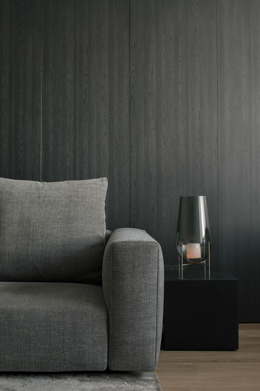
What looks like a room within a shophouse holds a self-contained bachelor pad. While the living and dining areas are bathed in natural light, the bedroom is the complete opposite. The decision to not oppose the existing context was made to go along and highlight the lack of natural light as a unique character to the space.
Visit site

CAPABILITIES
he entire home is segmented into three zone. Zone one is the living and dining area, zone two is for sleep, and zone three, there is a kitchen and a bathroom. The three zones are positioned according to their functions. Zone one and three require more natural light for entertainment,
reading, cooking, washing and eating, and so are laced at both ends of the home Meanwhile, zone two is for sleeping, so it made perfect sense to put it in the center where it’s the darker and more comfortable for resting.
More Details
The three zones are separated by sliding doors. You can see the entire home in one glance when all doors are open. To create a visual connection between the three zones, a simple light strip along the corridor guides you along the dimmed space like a cool special effect.
